A UI Challenge is a creative exercise where designers and developers push their skills to the limit by crafting innovative and user-friendly interfaces within a set of constraints or themes.
ECLIPSE (financial app)
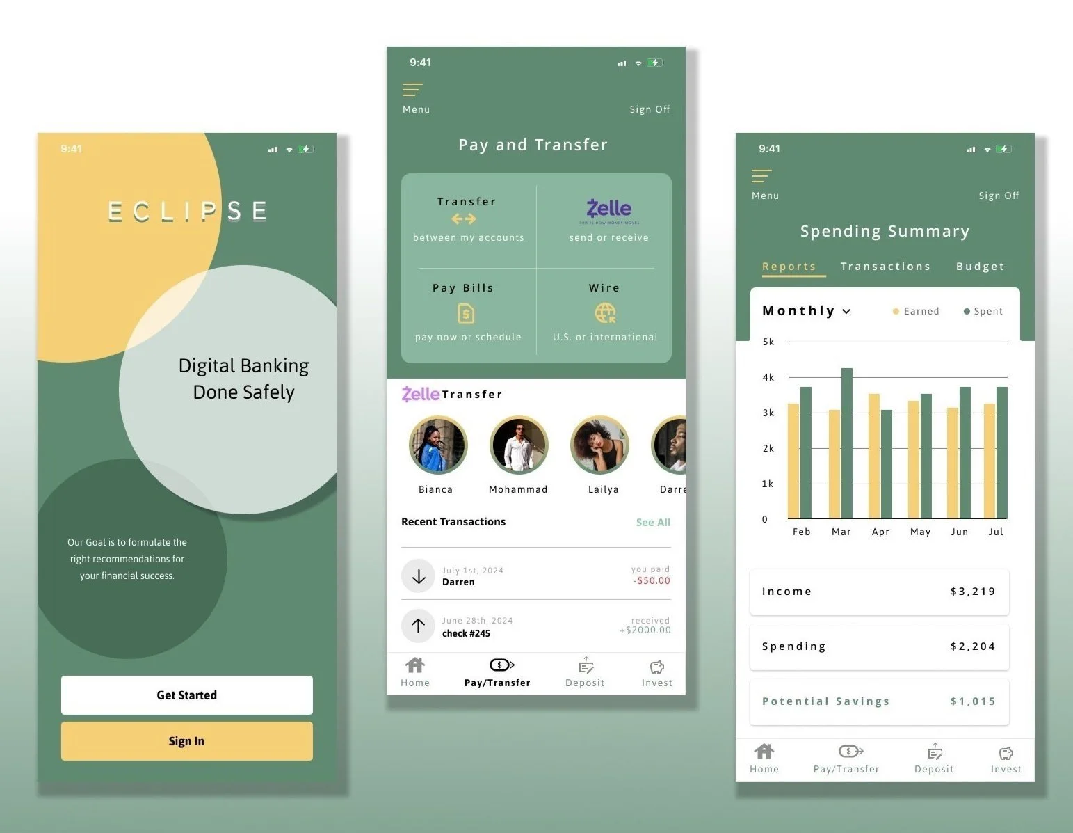
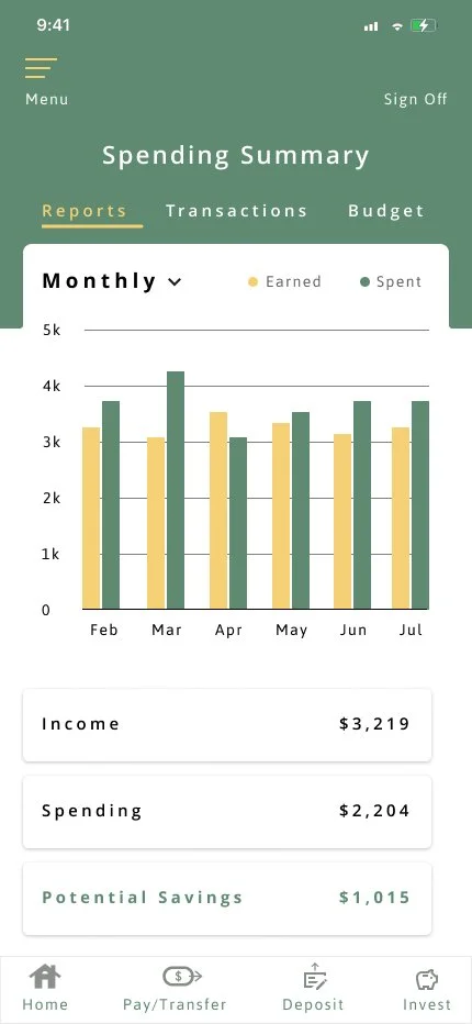
I was tasked with redesigning three key pages of a financial app to better adhere to design principles, with the goal of improving the user experience for tracking expenses and managing finances. The challenge was to create a more intuitive and visually appealing interface that makes financial management easier and more efficient for users.
For this challenge, I focused on establishing a strong brand identity for the app. I intentionally chose to keep the yellow and green color scheme, which stands out from other financial apps on the market, ensuring a distinctive visual presence. The app is named "Eclipse" to reflect the overlapping spheres seen on the splash screen, symbolizing the convergence of financial management and personal growth. This design choice not only aligns with the app’s theme but also reinforces the unique branding, creating a memorable user experience right from the start.
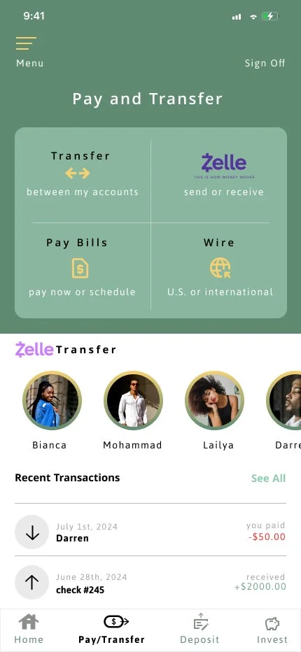
To align with the goal of creating an intuitive app for users in their 30s to track their expenses, I prioritized the use of simple, easily recognizable icons for clarity and ease of use. I also incorporated visual markers to highlight key banking activities, such as credits and debits, enhancing the user’s understanding of their financial transactions. Additionally, I focused on emphasizing the “Zelle” feature, which allows users to effortlessly transfer or request funds using contact information like phone numbers or emails, making it a seamless and integral part of the app’s functionality.

A key takeaway from this challenge was gaining a much deeper understanding of user-centered design. By focusing on the specific needs, behaviors, and preferences of the target audience, I was able to create more intuitive and functional interfaces. This approach emphasized prioritizing usability, accessibility, and clarity—ensuring the design serves the user effectively—rather than just focusing on visual appeal alone.


